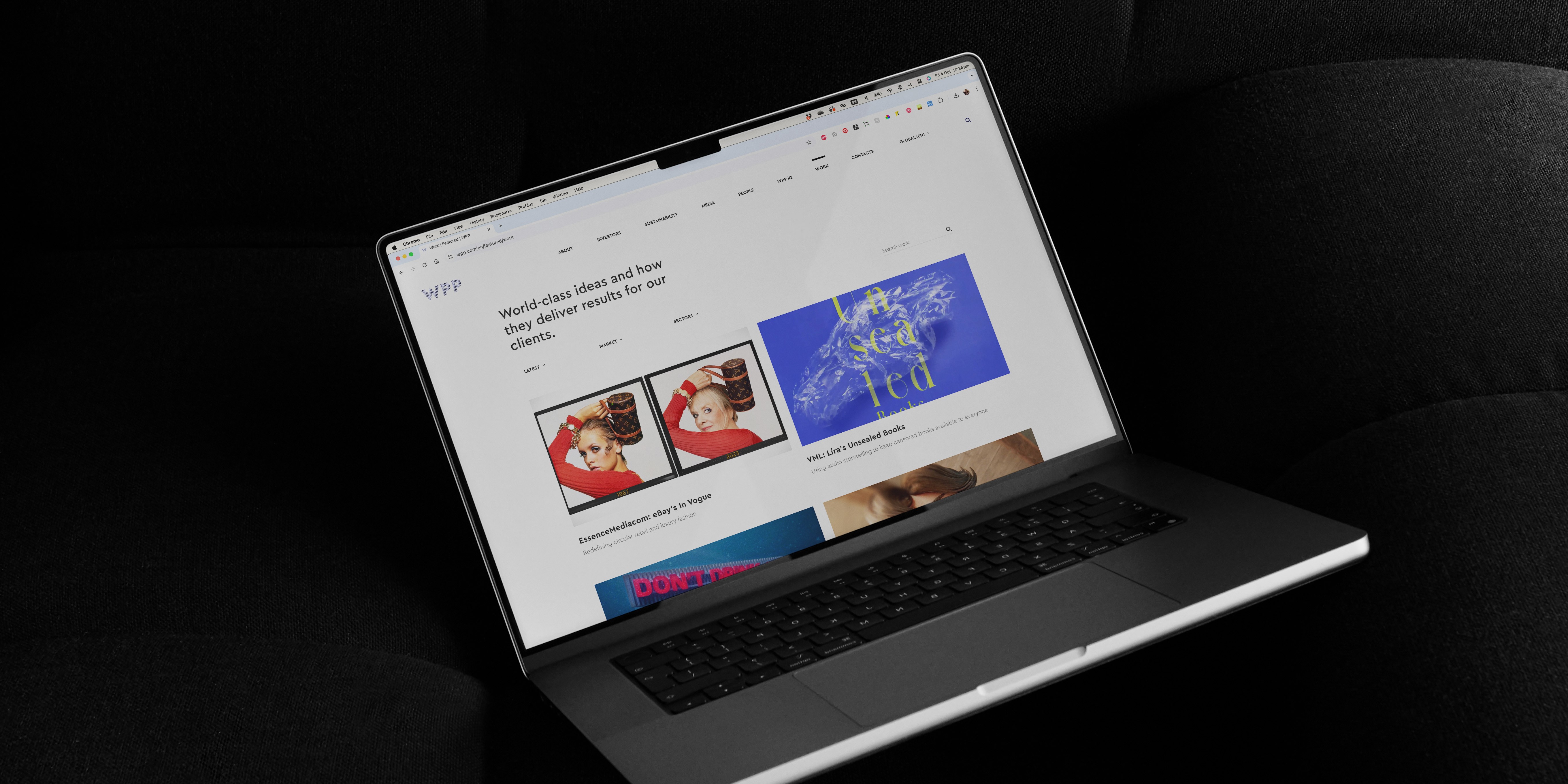
WPP website redesign

Client

WPP

Services

Web Design, Visual System, Accessibility

Year

2022

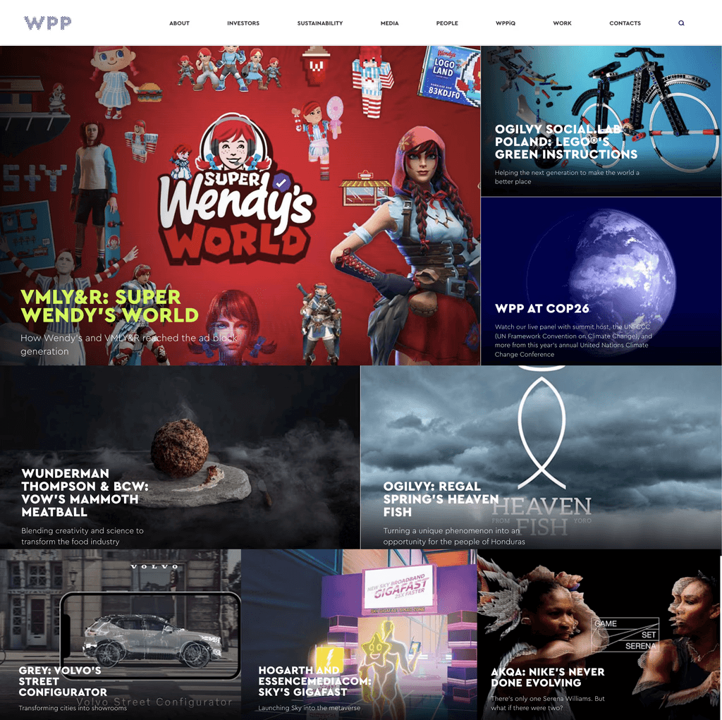
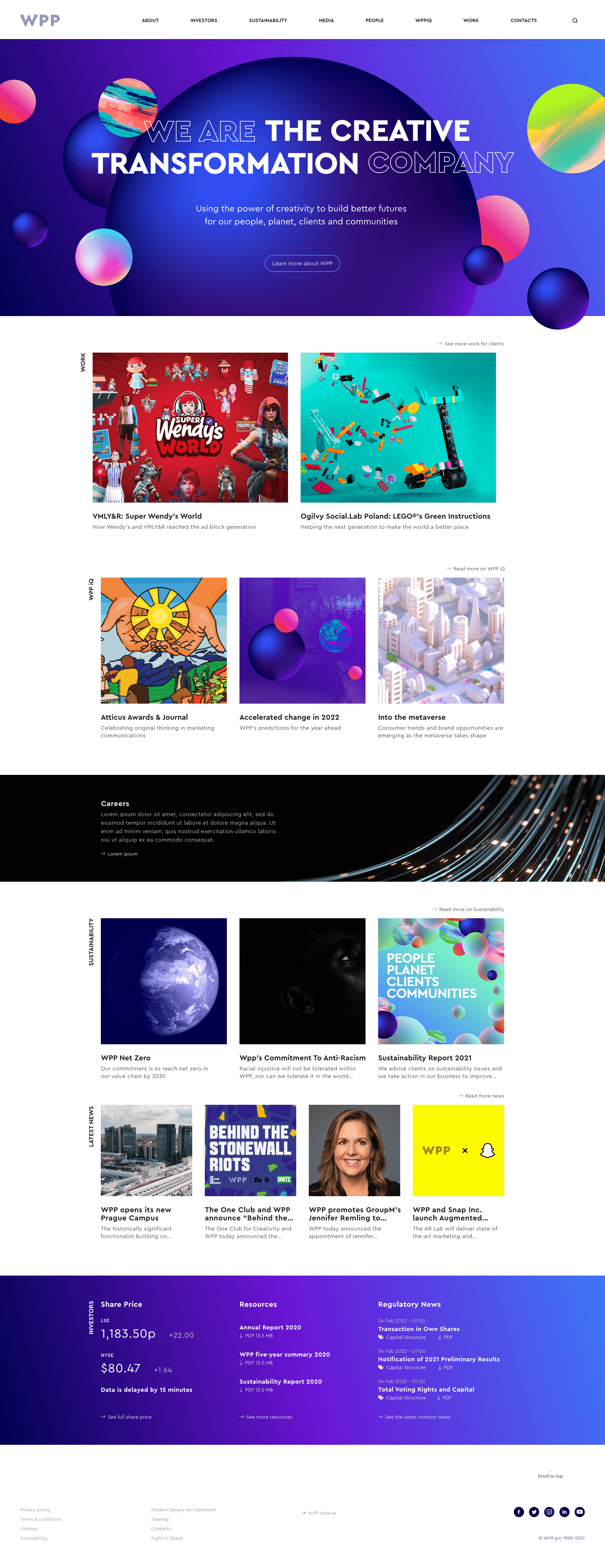
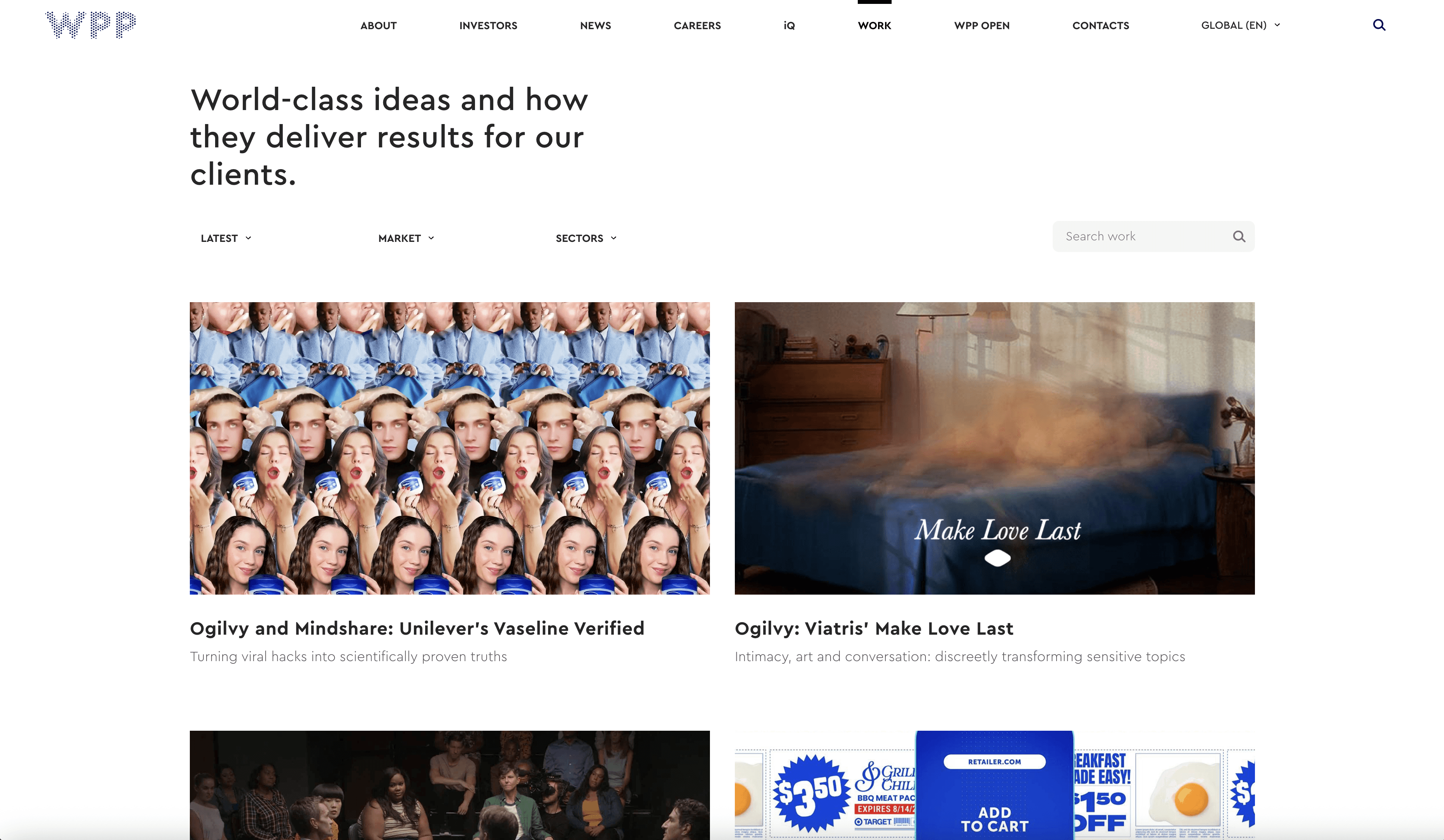
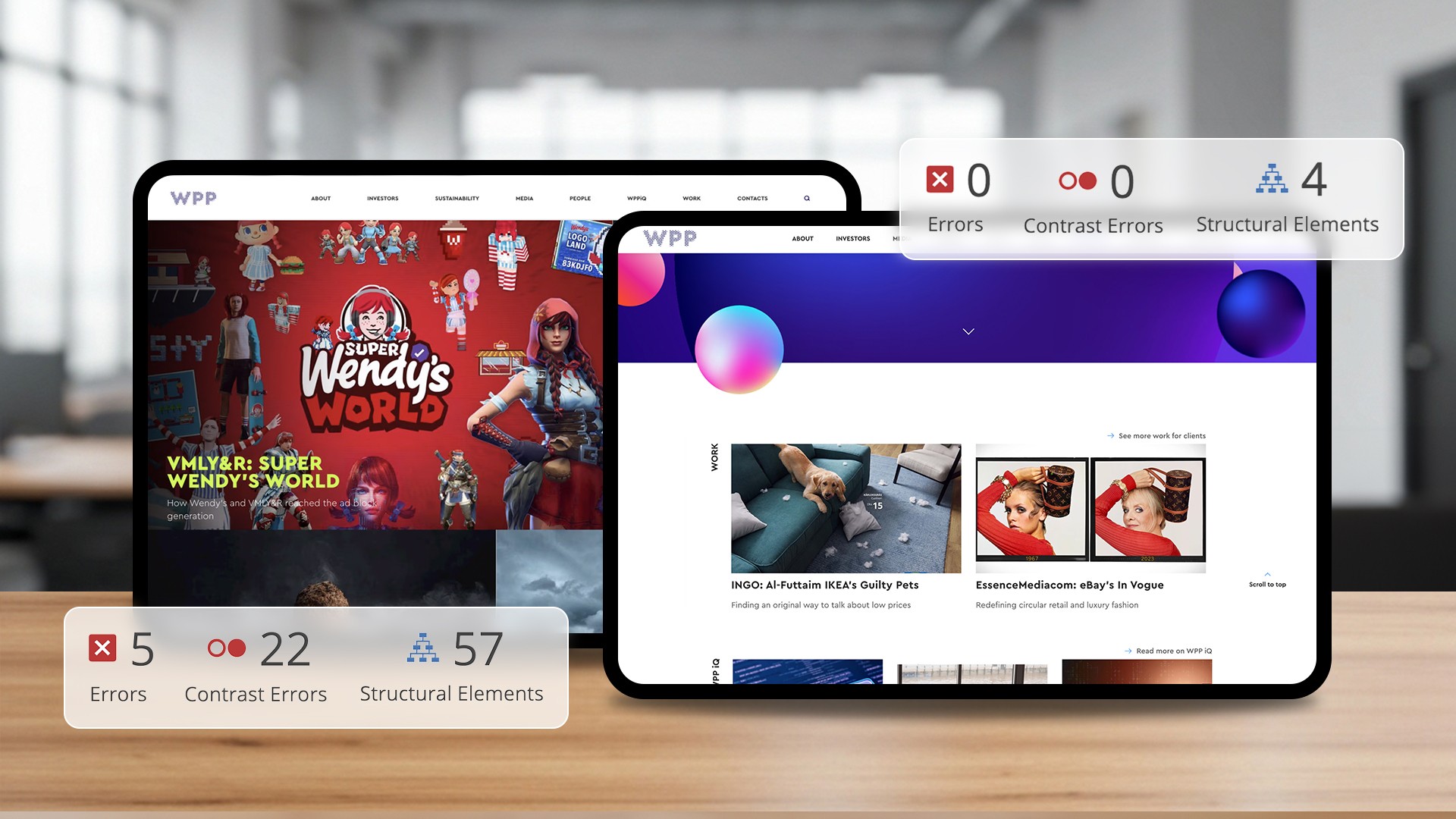
WPP’s global site needed a clearer, more accessible way to showcase the scale and quality of its network.

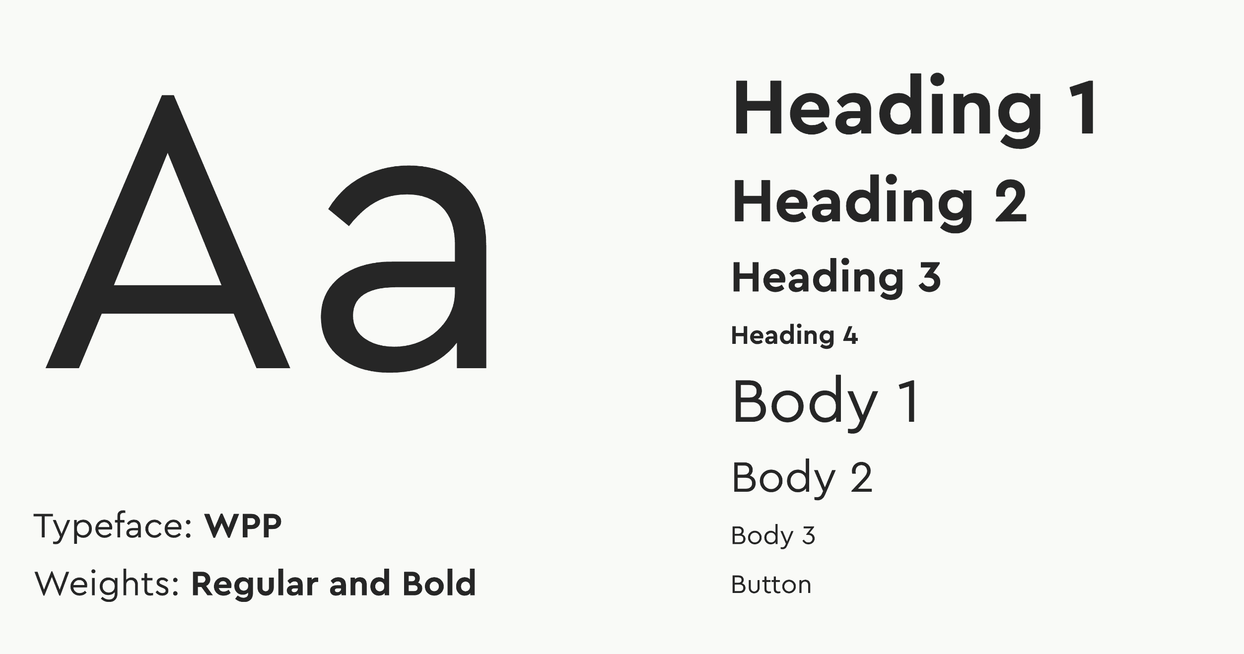
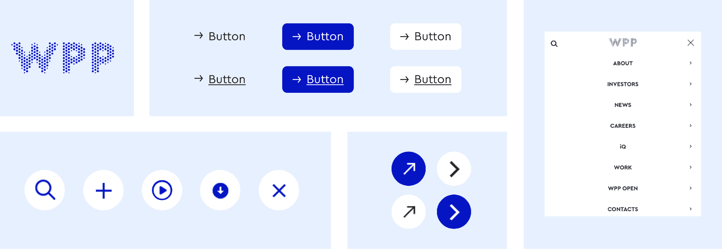
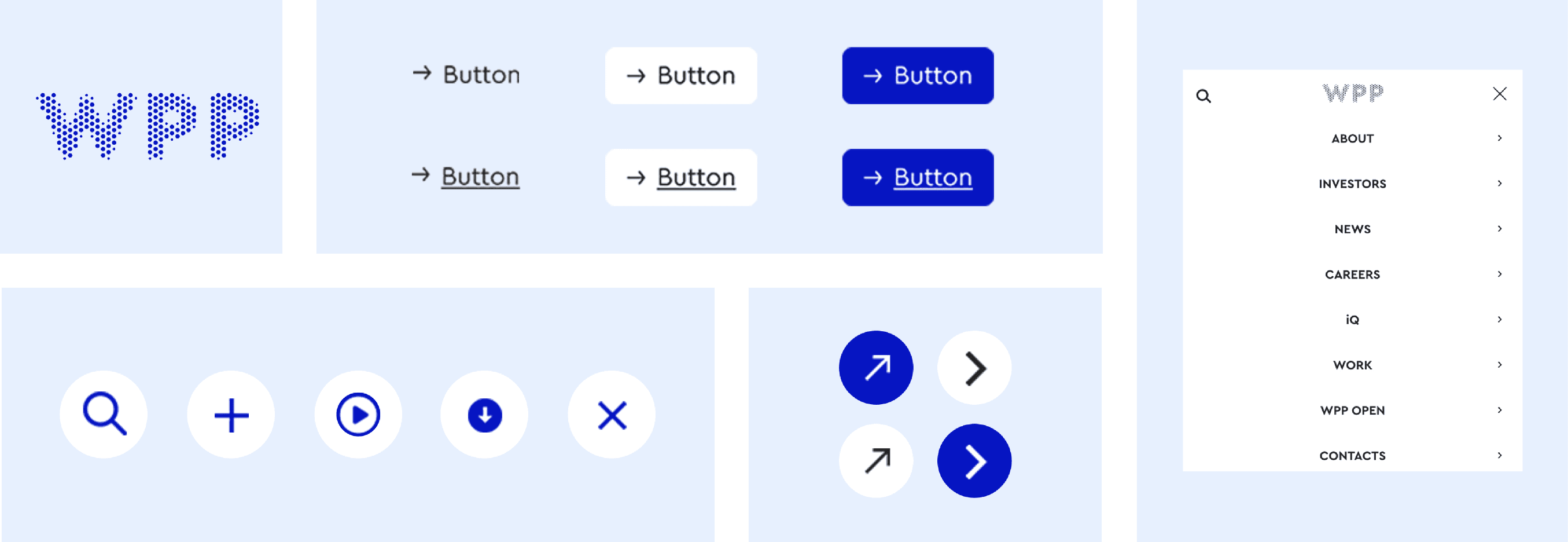
Our goal was to make the experience feel lighter and easier to navigate, with a modular design system that brings structure and flexibility.


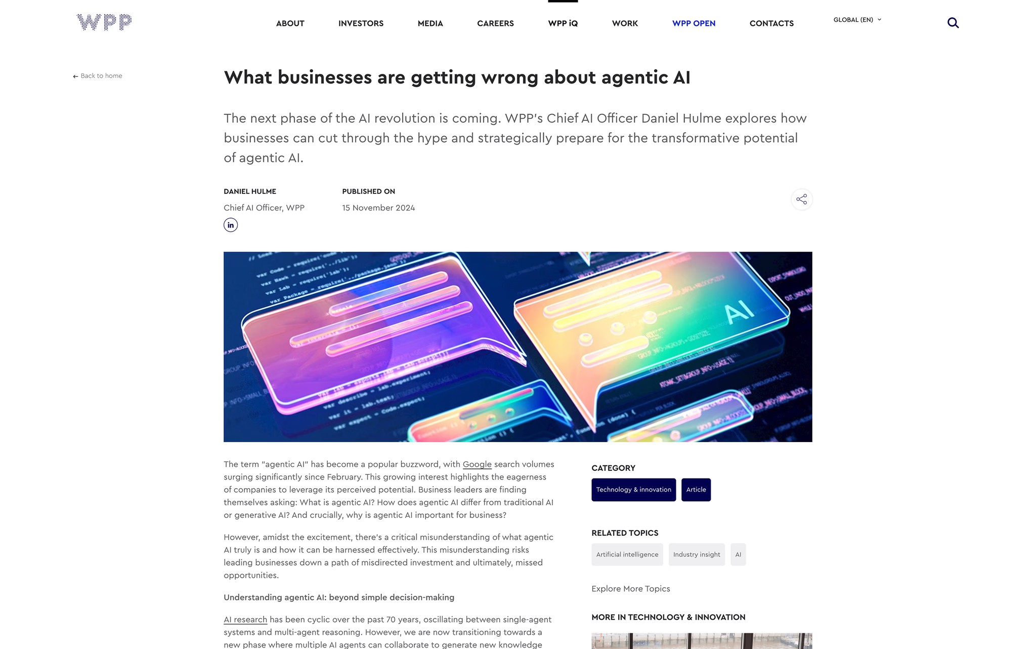
I redesigned key layouts, navigation and page structures to support clearer journeys and more engaging content.


The result is a streamlined online presence that makes WPP’s work and network more discoverable, supporting both brand consistency and better performance.

BEFORE

BEFORE

BEFORE

AFTER

AFTER

AFTER

Typography in use

Typography in use

Design elements

Design elements

Colour palette

Colour palette

Homepage redesign

Homepage redesign

Card layout system (Work page example)

Card layout system (Work page example)

The modular card layout is a recurring pattern across the site, simplifying dense content and guiding visitors through Work, Homepage, IQ and more, building a consistent, intuitive experience.

Enhanced content discoverability (WPP iQ article example)

Enhanced content discoverability (WPP iQ article example)

IQ articles use clear folds and topic tags to surface insights faster, helping users explore related content with ease.

The redesigned homepage replaces full-bleed visuals with a clear modular grid, making sections easier to navigate and more distinct. Flexible hero areas support dynamic elements like announcements or brand campaigns, creating a first impression that’s structured but adaptable.

Reorganised heading structure and semantic hierarchy to improve screen reader flow and meet WCAG 2.1 guidelines, ensuring clarity without compromising visual identity.

Typography in use

Typography in use

Colour palette

Colour palette

Design elements

Design elements

Homepage redesign

Homepage redesign

The redesigned homepage replaces full-bleed visuals with a clear modular grid, making sections easier to navigate and more distinct. Flexible hero areas support dynamic elements like announcements or brand campaigns, creating a first impression that’s structured but adaptable.

Card layout system (Work page example)

Card layout system (Work page example)

The modular card layout is a recurring pattern across the site, simplifying dense content and guiding visitors through Work, Homepage, IQ and more, building a consistent, intuitive experience.

Enhanced content discoverability (WPP iQ article example)

Enhanced content discoverability (WPP iQ article example)

IQ articles use clear folds and topic tags to surface insights faster, helping users explore related content with ease.

Reorganised heading structure and semantic hierarchy to improve screen reader flow and meet WCAG 2.1 guidelines, ensuring clarity without compromising visual identity.

Available for freelance projects and collaborations, get in touch.

. ݁₊ ⊹ . ݁˖ . ݁⊹₊ ݁. ݁₊ ⊹ . ݁˖ . ݁⊹₊ ݁. ݁₊ ⊹ . ݁˖ . ݁⊹

MARTINA RUSTICI® VISUAL DESIGN

2011—

2025

Available for freelance projects and collaborations, get in touch.

. ݁₊ ⊹ . ݁˖ . ݁⊹₊ ݁. ݁₊ ⊹ . ݁˖ . ݁⊹₊ ݁. ݁₊ ⊹ . ݁˖ . ݁⊹

MARTINA RUSTICI® VISUAL DESIGN

2011—

2025

Available for freelance projects and collaborations, get in touch.

. ݁₊ ⊹ . ݁˖ . ݁⊹₊ ݁. ݁₊ ⊹ . ݁˖ . ݁⊹₊ ݁. ݁₊ ⊹ . ݁˖ . ݁⊹

MARTINA RUSTICI® VISUAL DESIGN

2011—

2025