Workplace by Facebook
Scope
Brand development
Campaign design
Year
2017-2019
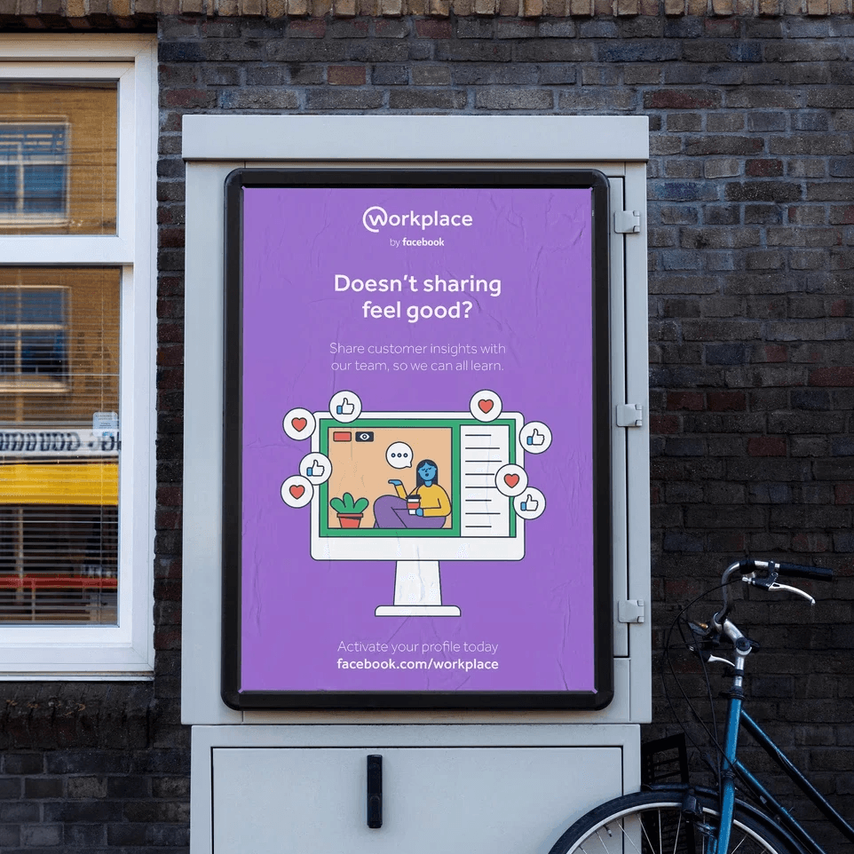
As part of the early design team for Workplace at Facebook, I contributed to the evolution of the platform’s visual identity during its initial phase, working across product, marketing and sales to create a familiar and approachable brand experience.

Bringing Facebook into the workplace
The challenge was translating Facebook’s familiar visual language into a workplace environment while maintaining the sense of openness, connection and accessibility associated with the brand.


The visual direction
The challenge was adapting Facebook’s familiar visual language to a workplace environment while preserving the openness and connectivity associated with the brand.


Applying the brand
The work extended across launch campaigns, onboarding materials, presentations and marketing assets, adapting the identity across different audiences and workplace contexts while maintaining a consistent and recognisable visual direction.


