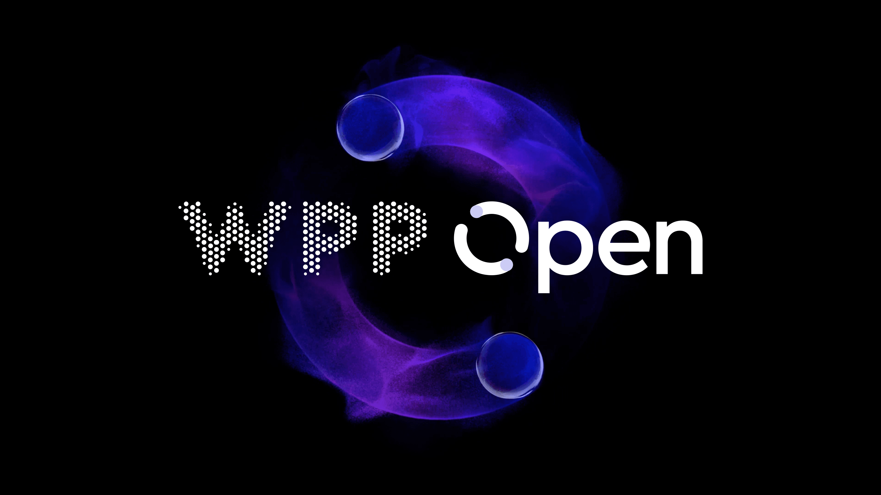
WPP transitional brand system
Scope
Visual direction
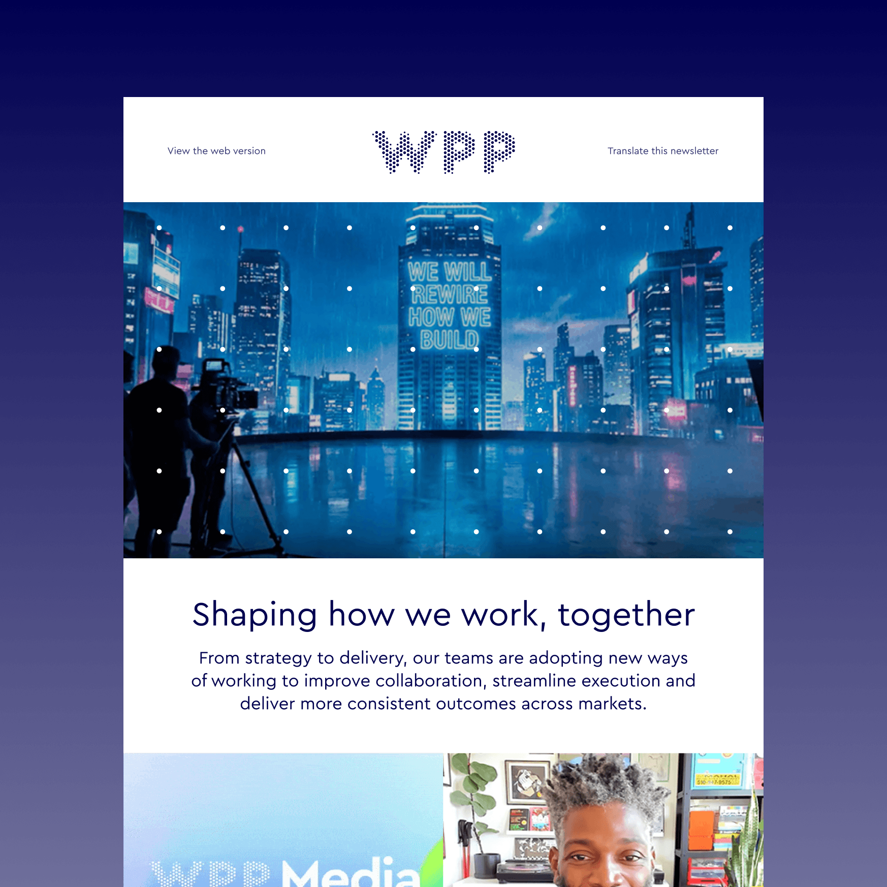
Digital communications
AI brand guidance
Year
2025
As WPP moved into a new phase under new leadership and a growing focus on AI, the existing identity no longer reflected the direction the company was moving toward.
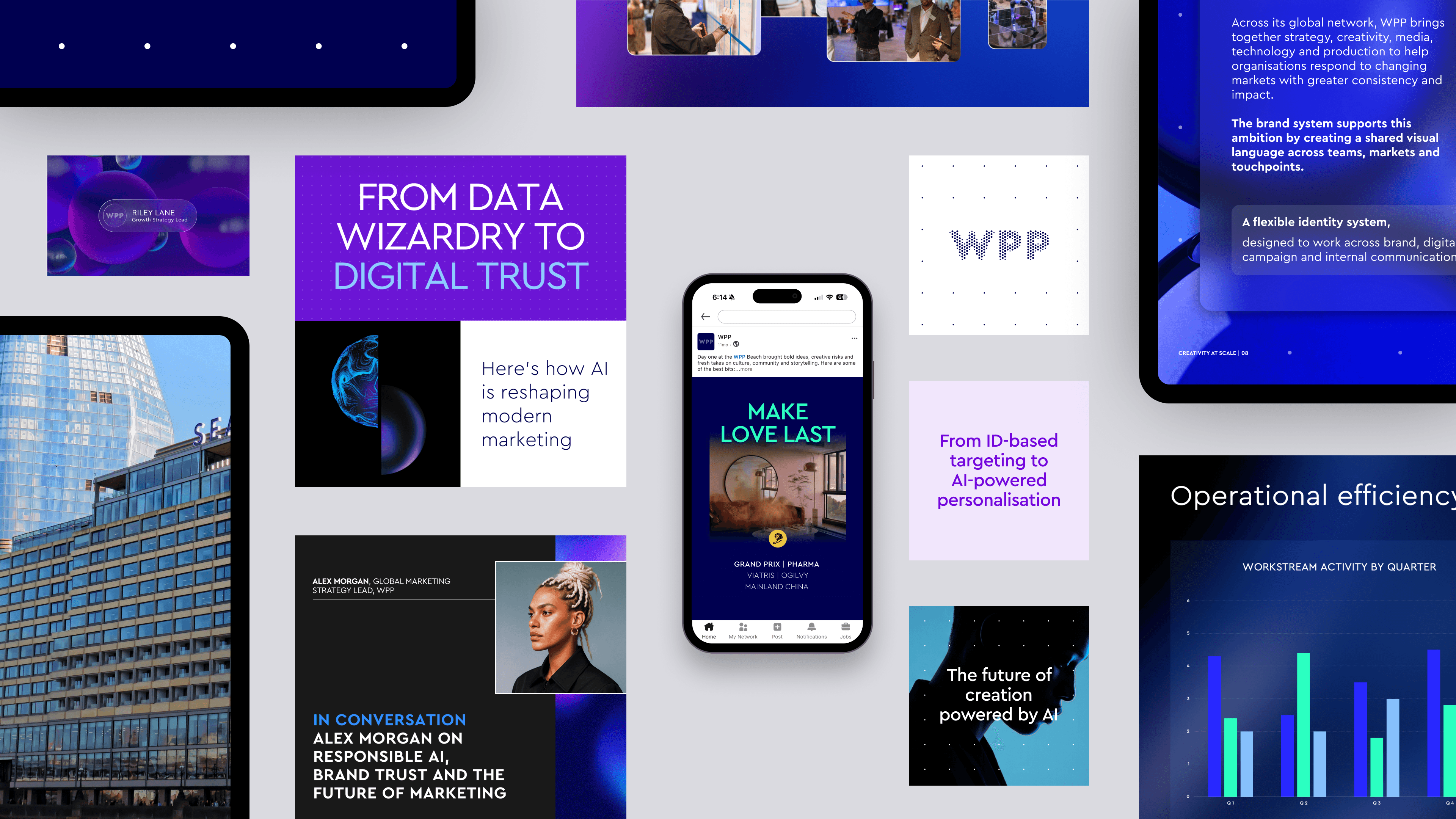
I led the visual direction for an interim system that could move the brand forward without requiring a full identity reset. The aim was to make familiar WPP elements work harder across digital communications, campaign content and internal tools, while giving teams a clearer way to apply them during a period of change.
The same system logic later informed an internal Brand Agent, designed to make brand guidance easier for global teams to access and apply.
Visual direction
The decision was not to redesign the core identity, but to change how it behaved.
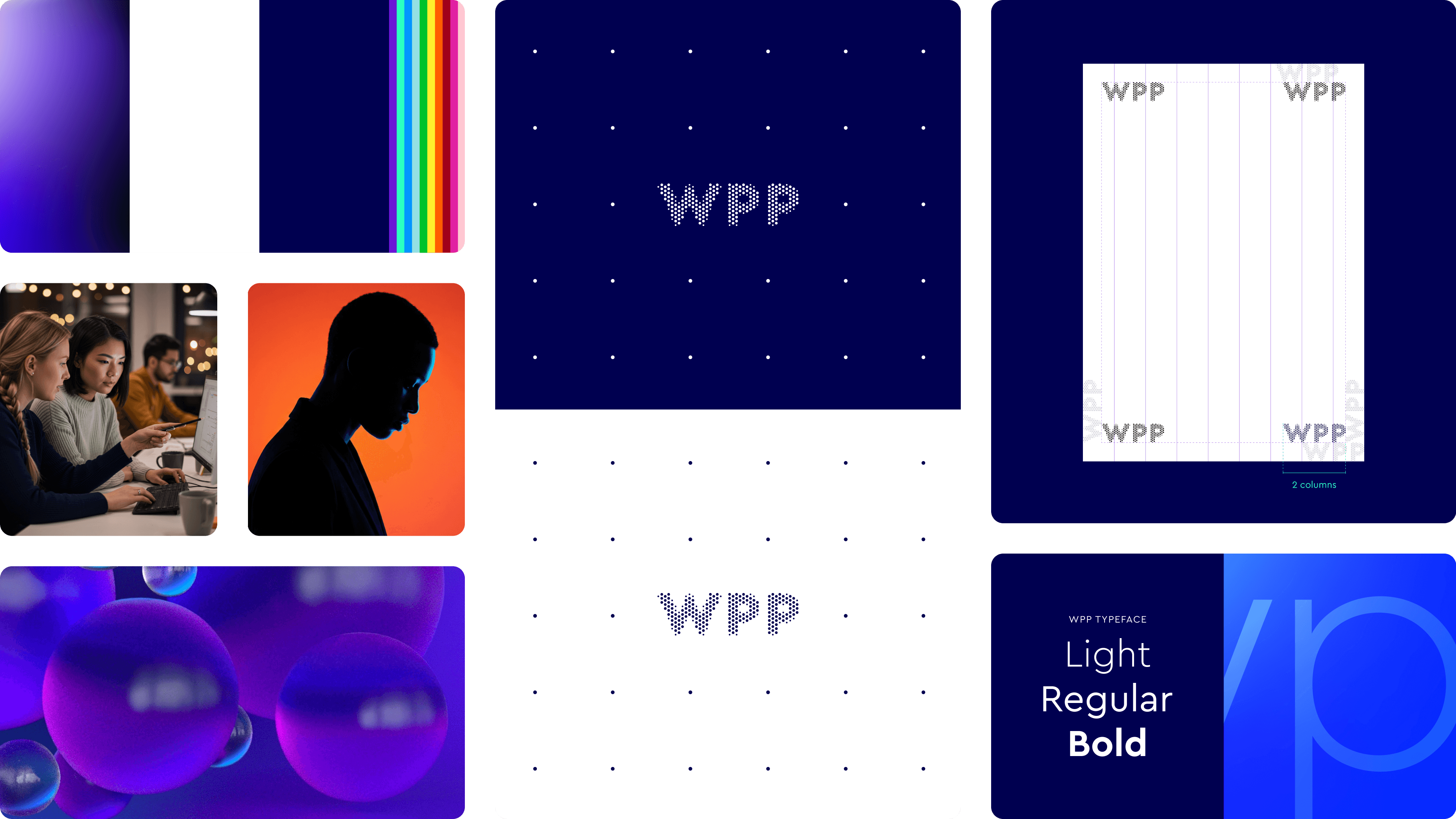
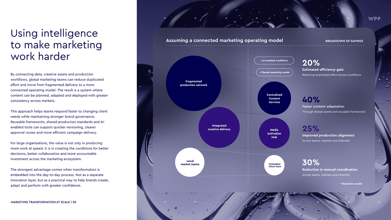
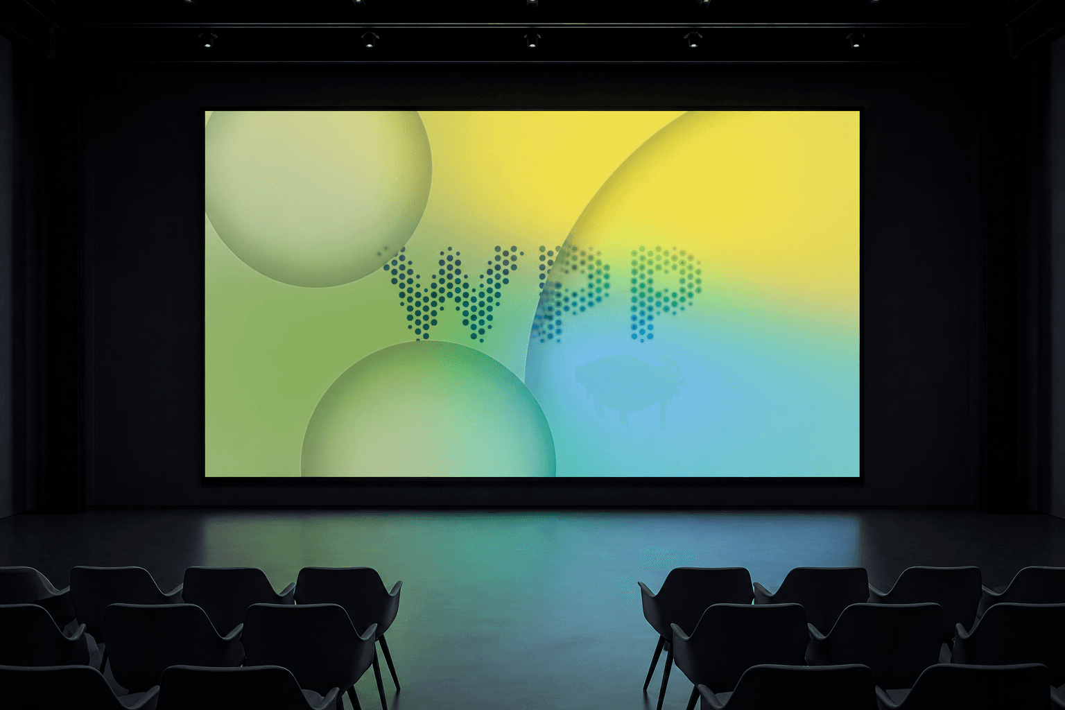
I kept the parts of WPP people already recognised, including the logo, typography and core colour palette, and shifted the expression around them. The older sphere treatments felt too heavy for the kind of digital and AI-led work the brand needed to support, so I pushed them into a lighter and more transparent direction.
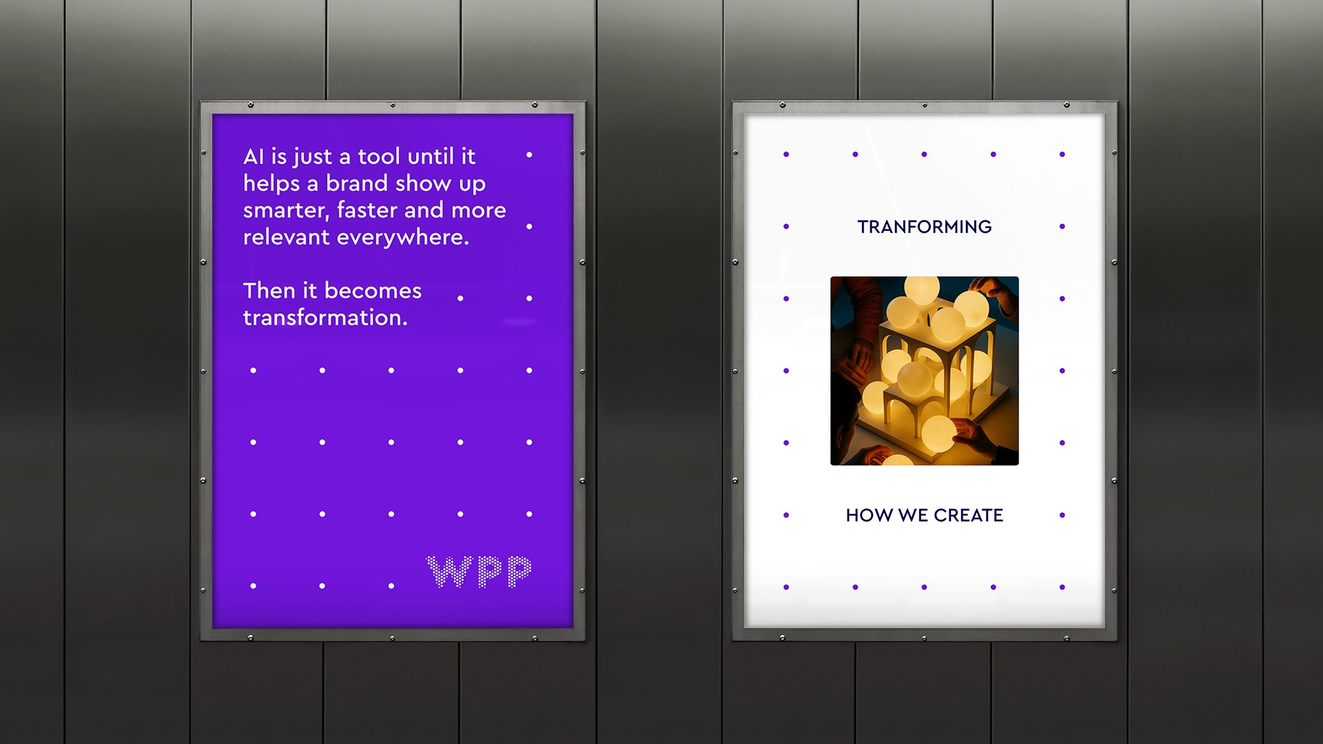
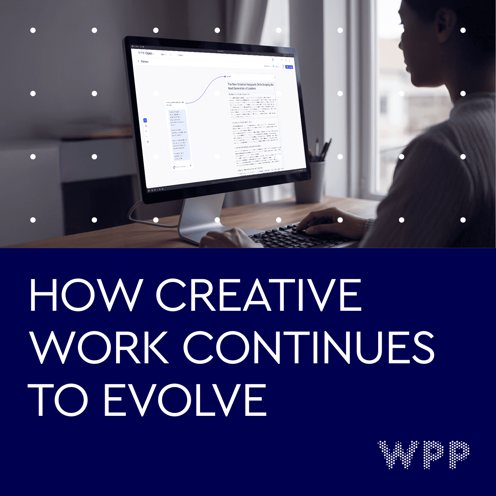
Because the system had to support very different types of content, from agency stories to campaign messages, I made the layouts more structured and content-led. Frames, collage and clearer hierarchy helped create variation without losing control of the overall brand expression.
Dot patterns helped suggest data, AI and digital layers while staying connected to the circular logic already present in the WPP identity.







Extending the system through AI
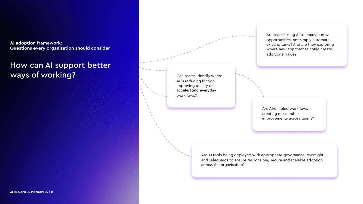
As the system expanded, the challenge shifted from defining the visual direction to helping teams apply it consistently.
The internal Brand Agent was designed around approved rules, assets and common use cases, so teams could get practical guidance without turning every brand question into a design review.
This made the system easier for global teams to use day to day, helping them understand which assets to use, how to apply the identity and when a piece of work needed further review.